
Design 101
Just like most marketing endeavors for your business, the first step in designing any asset is to set a goal. A great place to start is to ask yourself, “What do I want people to do when they see this graphic?” Maybe you want them to visit your website, purchase a product or visit your social media profile (so they can admire more of your beautiful designs). You should also consider who it is you’re targeting. That means a target audience. Pay attention to what kinds of designs attract them. Do they like minimal designs or maybe graphics with bright colors? It’s important to know what your audience likes so that you can attract them to your designs, whether it’s on your website or social media platforms.
There are four core principles of design to keep in mind while you let your creativity flow:
Contrast
Contrast can come in many forms. Simply put, contrast a stark difference between two or more elements of a design, whether that be colors, fonts or photography. High-contrast elements attract attention and make for an eye-catching graphic. Contrast can be useful to attract your audience to the first thing you want them to look at.

Contrast
2. Repetition
Repetition is the use of similar, connected or the same elements multiple times in a design. It can be regular, meaning evenly spaced in a pattern, or irregular. It can give your design movement, unity and consistency.

Repetition
3. Alignment
A design with alignment is one in which elements line up with one another. Though alignment is not what will make people’s eyes pop when they look at your design, it will make it much more pleasing to look at. Elements in your design can be aligned by measurements, but look unaligned due to the design of different fonts or graphics. If this happens, don’t be afraid to align the elements the way your eyes see them, not by measurements.

Alignment
4. Proximity
The principle of proximity encourages designers to group similar elements nearby each other in order to emphasize their relationship. Using proximity wisely can help you avoid a cluttered design and invoke a clearer visual hierarchy. One way to enhance proximity is to make use of white space. White space is the blank or negative space in your design that you want to remain blank to separate groups of elements and avoid a design in which your audience doesn’t know where to look.

Proximity
One of the most fun parts of designing is choosing colors! There’s a lot to think about as far as color so let’s break it down:
Warm Colors: red, orange, yellow, brown
Warm colors are often associated with feelings of passion, happiness, power and energy. Use warm colors to make your design feel, well, warm.
Red: love, energy, passion, courage - can be used to stimulate, caution and draw attention
Orange: optimism, independence, adventure - can be used to express freedom, communication
Yellow: happiness, opportunity, spontaneity - can be used to encourage, raise awareness, and energize
Brown: reliability, stability, natural - basically what you feel hanging out with a chocolate lab

Warm Colors
Cool Colors: green, blue, purple
Cool colors often have a calm, serene connotation.
Green: growth, harmony, balance - can be used to promote growth, restore energy and relax
Blue: freedom, trust, responsibility - can be used to portray calmness, positivity and create order
Purple: imagination, spirituality, sensitivity - can be used to induce creativity, wisdom and indicate wealth or power
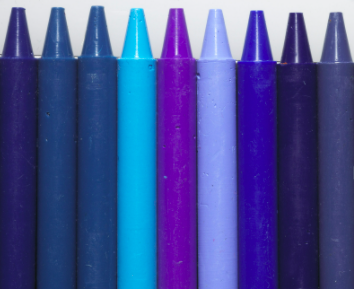
Cool Colors
Neutral Colors: White, black, gray, tan
Although neutral colors aren’t typically associated with a particular feeling, they’re the neutral space in your design that the colors you choose can leap out of.
Black: power, control, discipline, elegance - can be used to hide feelings, intimidate, establish authority
Gray: neutral, practical, formal - can be used to show sophistication and emotionlessness

Neutral Colors
How you use color in your designs makes a huge difference. It can make or break not just your credibility as a designer, but can make or break the credibility of your brand. For more information about color theory and how to use it, check out this infographic and article.
Finally, there are a couple of miscellaneous design best practices you should bed aware of as they’re applied to different mediums:
Social Media
Rule of Thirds: This rule is more specific to photography, but if you’re including photos in your designs or brand assets it’s good to keep in mind. The Rule of Thirds comes from applying a 3x3 grid to a photo. Whether you do that with design software or just inside your head is up to you. Once you have your grid, take a look at what elements of the photo are on one of the lines that make up the grid. The Rule of Thirds suggests that the important aspects of the image should align with one of those lines.
Know Your Dimensions: Whether you’re posting on Instagram, Youtube or a Facebook story, one thing that will turn people off of your design the fastest is if your graphic or image is not the optimal size for the platform.
Gutenberg Diagonal: The Gutenberg Diagonal is a principle to think about especially when you’re creating print products, but it does apply to web design as well. It suggests that your eyes naturally follow a Z-shaped pattern when scanning a page for important information. That means people typically start in the top left corner, move right to the top right corner, follow a diagonal path down to the bottom left corner, and finish up in the bottom right corner of the page. Try putting the most important elements along these four touch-points.
Web
Choose one color as your Alert Color. This is the color you’ll use for all your buttons so that visitors to your website will know to click! Try to choose the boldest or brightest color of your palette.
Finally, one of the most important things to remember while you design is that less is more. It’s so easy to get caught up in the fancy things design software can do or a really flashy concept you’ve seen somewhere else. At the end of the day, a clean design is better — you want to avoid a cluttered feeling with elements too close to the edges.
Good designs can really set the tone for your business, no matter what it is. If you’re not sure where to start with your marketing strategy, schedule a call with Bamboo Reach to get started today.